
"Termustat"
Industry : Online study plan schedule
Date : 2022
Location : Milan, Italy
Employer : Freelance
Role : Product Designer
Termustat is a platform for students to choose their desired courses and schedule the study plan without any conflicts.
.png)
Background
Termustat is an online planning tool to help students schedule their incoming university semester.
The first verion of Termustat released in summer 2018, supporting math & computer science faculty of Kharazmi university. Termusat now, supports 3 universities (Kharazmi-Tehran-Khaje Nasir), 27 faculties, 27700 students and it has +1000 active users.
Termustat has saved over 5000 hours of students' time and it totally changed the way students plan their academic schedule. It is recommended by the head professor of the department of computer science.

Experience
While Termustat was born at 2018 with the initial design system, on 2022, as we gained several feedbacks, It was decided to be redesigned from base.
For this project, I was responsible for understanding and balancing user needs with product requirements to inform our UI and overall experience. The redesigning of This project was complex due to the timing, but I thoroughly enjoyed becoming a subject-matter-expert to take on the challenge of creating intuitive, simple and transparent user experiences that met the strict regulations we had to comply with.
Tasks
-
Running survey
-
User interview
-
User flow and site map
-
Usability testing
-
Data analysis
-
Proposing solutions
-
Wireframe - sketch digitally and on paper
-
Heuristic analysis
-
Maintain and update design system
-
Prototyping
Tools
Figma, Miro, Google Analytics, Hotjar, Adobe Photoshop, Microsoft Excel

As-Is User Journey
Project Goal
-
Uncovering user's pain points
-
Cut down users negative feedbacks from 3 to 4 out of 5
-
Decrease the number of drop-offs on the landing page by 30%
-
Increase the number of registrations with more than 400 users
-
Having and up-to-date design
-
Improving intuitive navigation system
Research
With interviewing more than 25 users that were already registered and has used the platform, more than 15 people who were new to Termustat, benchmark the competitors and analyzing the insights from Google analytics, Hotjar and survey, I finally gathered the most important insights from these "qualitative" and "quantitative" data.
You can see some of them in the following part.
.png)
Qualitative data from interviews & survey

Average rating of the experience:
3 out of 5
"I I can’t find the courses easily on schedule page"
Courses in some departments are so hard to track and find
"We are not able to see the study plan for previous semesters we made"
"The schedule page is so confusing to me since I have to scroll every time I choose a course"
"I can't navigate well in the website"
"Mobile version is not responsive"
They need a fast help if they face any problem
(Live chat)
Quantitative data from Google Analytics
User's feedback

Describe your image


Describe your image
Describe your image
Google analytic insights
On Google analytic, I measured "users behaviour" by behavioural flow including the time spent by each user on each page, drop-offs and exit pages and some other useful info like devices used and gender of users.
Infographic Results
With the numbers extracted from google analytics, I reached the number of drop-offs for the main page which is 45% and is almost half of the users that when they landed on the main page, they dropped off and exit immediately. So, one of the goal is to cut down this number by 30% , which is an improvement in user's drop-off from the main page which is our most important page in the website.
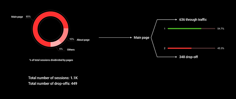
Main page through traffic drop-offs
Information Architecture
.jpg)
To-be User Journey
Schedule study plan

User's behaviour
With Hotjar, I could track the user's behaviour by following their clicks, scrolls and mouse movement during the testing.

Hotjar chart
Usability Test
With conducting 7 usability tests with users, we saw that the interaction with the feature was improved and the users were happier and less confused.
Navigation and choose the courses time in the platform were decreased to 3-4 minutes (Initially it was more than 10 min) which is a huge success
Final outcome & Result
1. Number of new users
As you can see below, the number of new users has been increased by 563 people which is even more than the project goal (400) and what I expected which means that in this version of the web app, the project for the goal defined earlier, has been done completely successful.


2. Feedbacks
By measuring the feedbacks from the students in the process on the website, It has been increased by from 3 to 4 out of 5 which is a good number that shows the students satisfactory.
3. Number of Drop-offs in landing page
Between the release of the new version of Termustat and the time dedicated to the testing and analyzing, the outcome we received was: total number of 124 sessions, 83 sessions for the main page, 69 successfully interacted & entered the next page and 14 drop-offs.
Result: 20% drop-offs
This is a great result since it reduced by 25% from the initial drop-offs which is so close to the goal that had. As a result, the main page is more interactive than before

Final Thoughts
The research on this platform will be still going on and the result which mentioned, is for the goal in that period of time.
Future Work
-
In the future, our main goal is to increase the number of returning users
-
Focusing more on the experience for the mobile version